Design Timeline
How All About Symbian looked across 20 years. Six distinct designs, each reflecting the web and the mobile industry at the time.
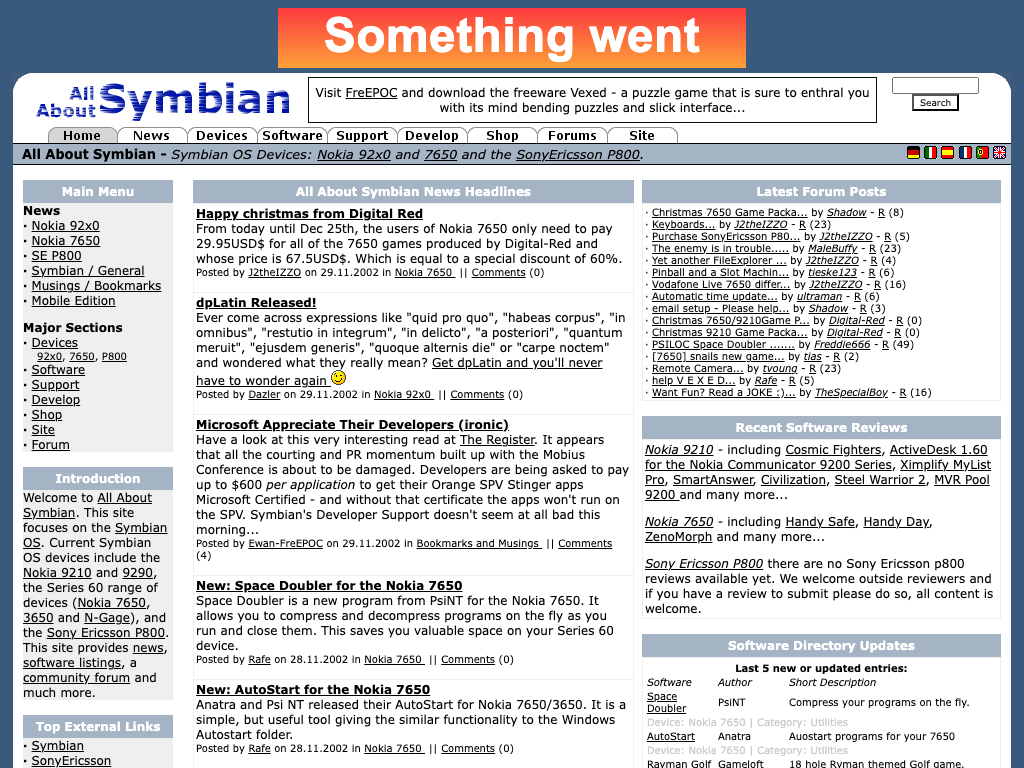
The original design, just weeks after the site launched as "All About Symbian". HTML tables, a blue-grey colour scheme, and a sidebar packed with forum posts and software reviews. Very much of the early 2000s web. Everything was hand-coded.
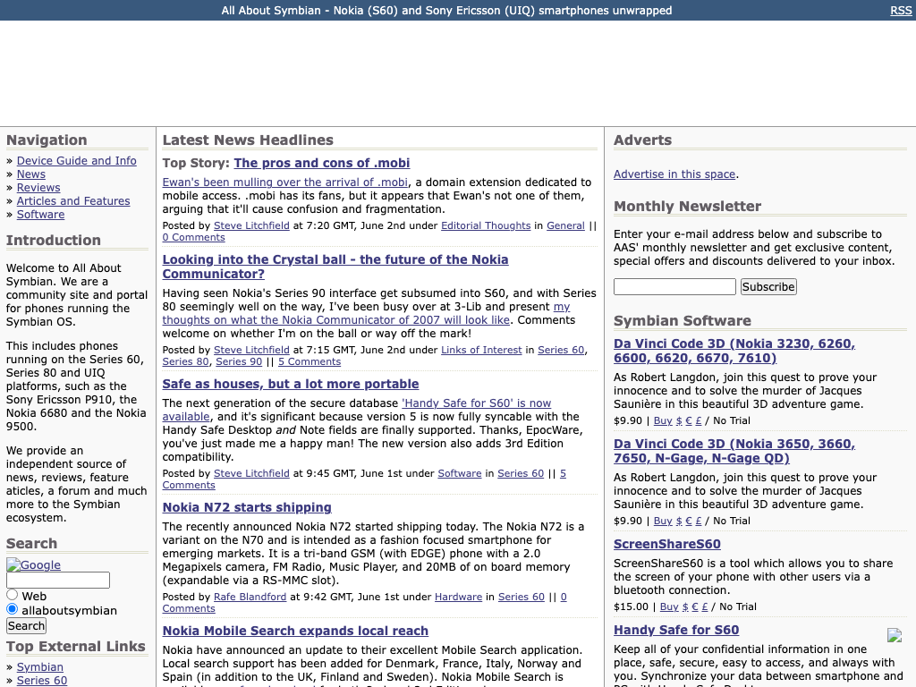
A cleaner three-column layout. Navigation on the left, content centre, software ads and newsletter signup on the right. Text-heavy, information-dense, with a monthly newsletter sign-up prominent in the sidebar. The site was now running on the custom CMS.
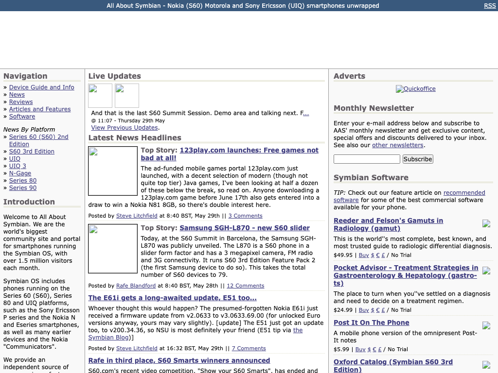
Same core layout, but the navigation now includes "News By Platform" covering Series 60, S60 3rd Edition, UIQ, and N-Gage. A live updates section appears at the top for event coverage. The site claims 1.5 million visitors a month. This is peak Symbian.
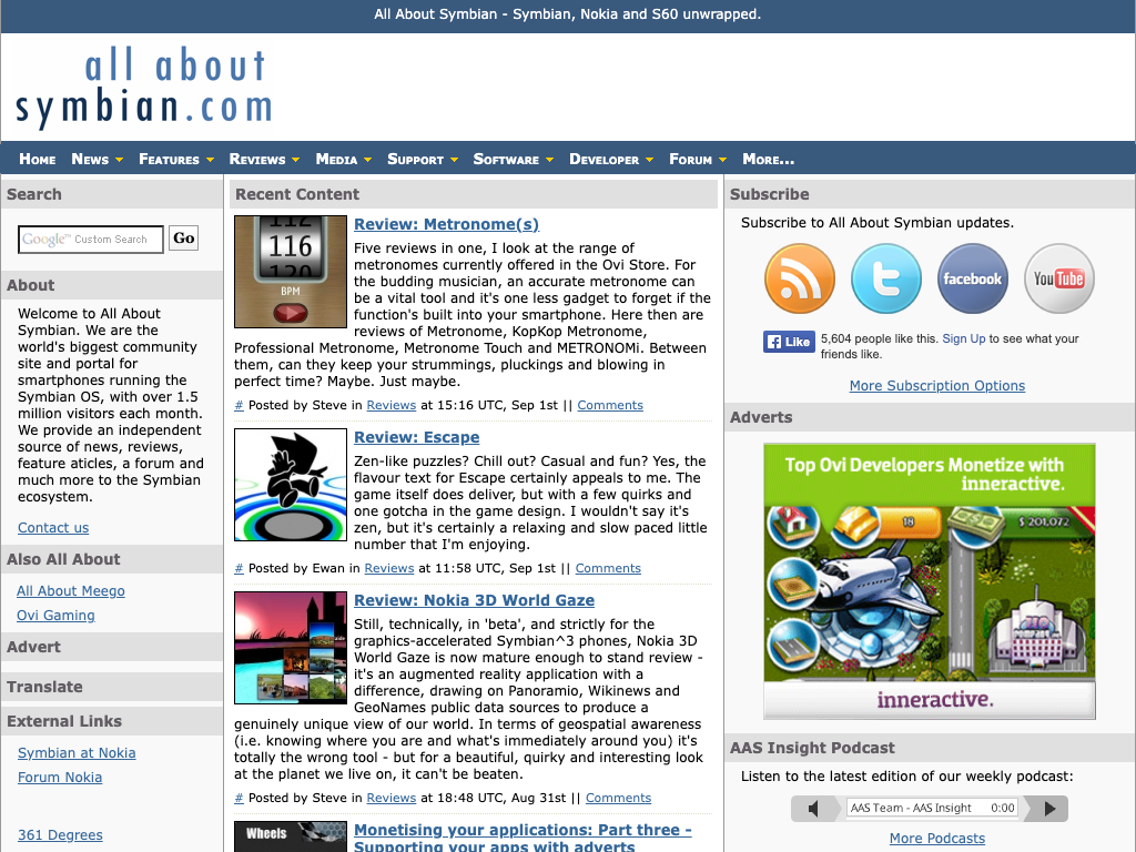
A significant redesign. The "all about symbian.com" script logo, a dark navigation bar, and social media buttons everywhere: Twitter, Facebook, YouTube, RSS. Podcasts are featured. Links to All About MeeGo and Ovi Gaming in the sidebar reflect the expanding network of sites. The web had changed, and the design changed with it.
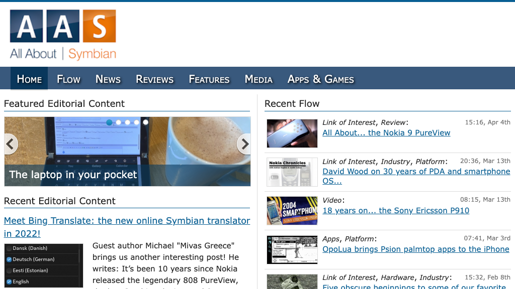
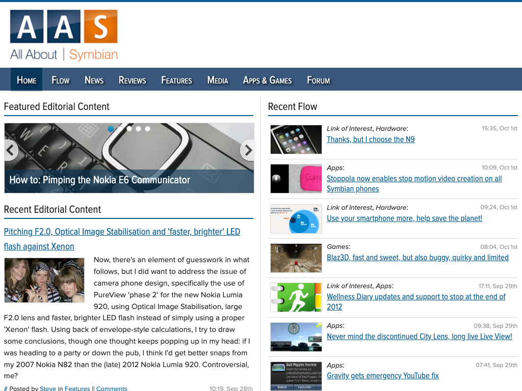
The last major redesign, and the one preserved in the archive today. The bold AAS block letters, a cleaner navigation bar, featured editorial content with image sliders, and the "Recent Flow" column for quick news items. This design carried the site through its final decade.
The site as it appears in the archive today. The same 2012 design, with legacy scripts stripped out, an archive banner added, and performance optimised. The content is unchanged.